Indoor signs


11/20/2023
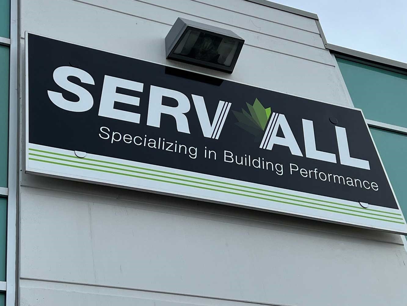
At least once a week when returning to the Image360 office, we pass a local business whose sign is mounted on a brass-colored building fascia. It faces a busy intersection that sees thousands of cars each day and the opportunity for repeated impressions is significant. The only problem is that the sign for this business isn't visible to anyone at the intersection because whomever designed it missed a few crucial points. Why? The sign letters are a brass color so they blend into the building. You can see that there are letters there, but you can’t read them.
Unfortunately, a lot of businesses lose the benefit of their signage investment due to simple, avoidable mistakes. To maximize your signage visibility and your hard-earned marketing monies, follow these tips:
Font Selection
Opt for clear, legible fonts with simple designs for signage. Sans-serif fonts are often more readable from a distance. Ensure the font size is appropriate for the viewing distance and maintain good contrast between the text and background. Avoid overly decorative or complex fonts that may hinder readability, especially in outdoor or fast-moving environments. The spacing between letters and lines should also be considered.
Size
For optimal visibility, a general rule of thumb is to have at least one inch of letter height for every 10 feet of viewing distance. If your sign is meant to be viewed from 50 feet away, aim for a minimum 5-inch letter height. Adjust this based on factors like the viewer's eyesight and the speed at which they are moving, ensuring clarity and readability. The faster vehicles are moving, the larger lettering needs to be to be seen.
Color Contrast
Our inspiration for this article is a perfect example of color contrast issues. Example: If your building is cream colored, white sign letters won’t be as visible as black letters during the day – but what about the night? Black letters at night won’t be visible either! Sign pros run into this all the time – that’s when you use a perforated vinyl on your sign faces. By day they appear a darker color, but at night, they appear white. Problem solved! Is your building a dark color? Then your sign letters should be light in color. If you can use your logo colors, that’s great, but it is more important that your signage be visible – otherwise, why have it?
To be fair, we should point out two things about contrast:
1. Whoever did this sign had to work from drawings as the building is new, BUT construction drawings specify materials, paint colors, and materials, so a simple check of the drawings would have ensured a successful outcome.
2. The logo might actually be a brass color, BUT that's when you tap the designer to give you alternate neutral colors to utilize in instances such as this. Most professional logo designs already take this into account and include neutral acceptable options.
Lighting
There are many ways to light signs (front lit, back lit, down lighting, up lighting) – you get the picture. But the focus here is more about things that can shadow the sign. And what we’re talking about is signs that may not be mounted flush against a wall (think of a spacer between the letter and the wall) so they throw shadows that can make the sign hard to read. We always approach these design elements with caution and carefully consider the light source when considering the material depths of letters and logos so that they are clearly visible whether viewed straight on or from an angle. They can look great or they can be problematic – to maximize your visibility you want to think this through before proceeding with standoff-mounted letters.
Building Placement
Last week we had a client ask for a sign on their building that would look great. Today. It’s almost winter in MN and the leaves are off the surrounding trees that are healthy and growing. It would only be a matter of time before the sign is no longer visible making that sign a bad investment. The second we asked about trees, the client started looking for another placement location. Trees can be trimmed or removed, but if the solution is simply to place the sign in a smart place to begin with, it saves a lot of work (and a tree).
Ultimately, taking the time to engage a professional signage company like Image360 Woodbury will ensure that potential issues like those listed above don’t negatively affect your sign investment. We are adept at working with your general contractor and drawings and are skilled at working within city signage ordinances and designs to result in a perfect, visible solution. You may buy one or two signs in your lifetime, but we work with them every single day and our number one goal is to make sure that your potential clients can find you!