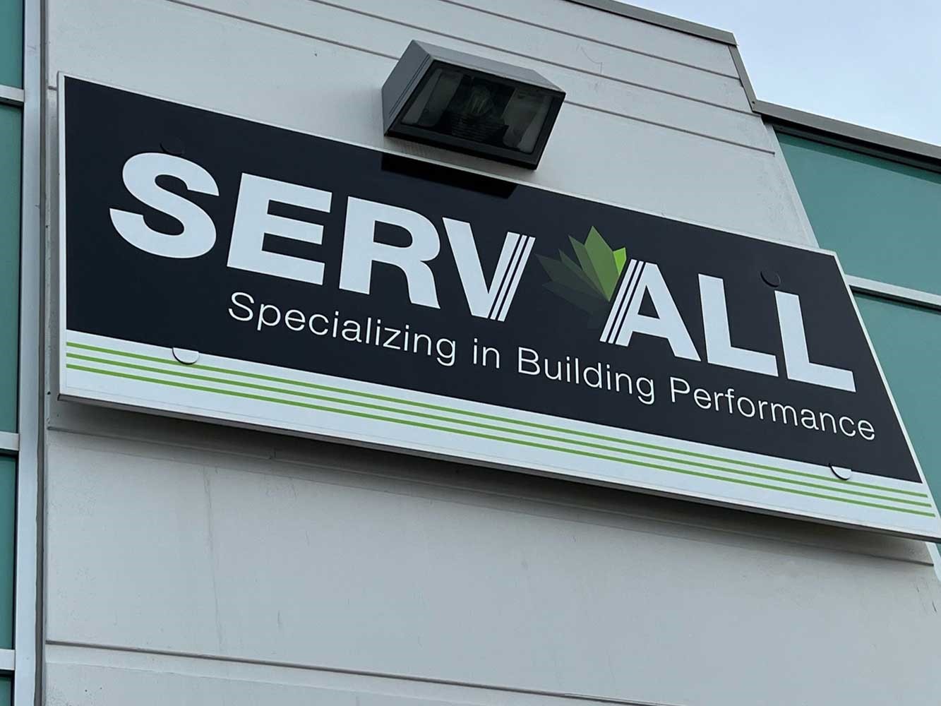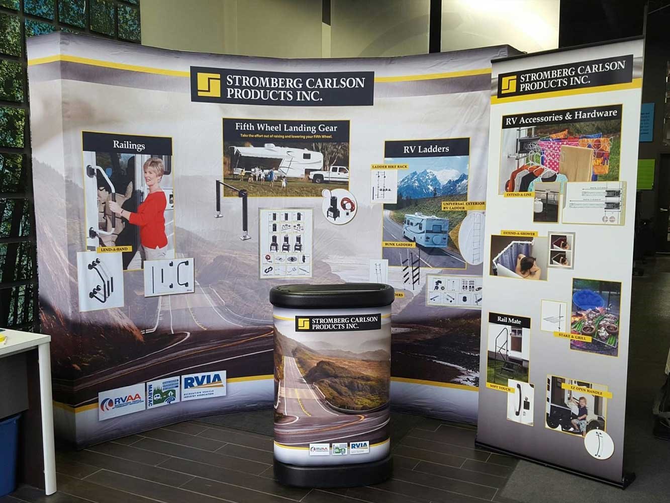
Indoor signs


7/10/2017
One of the most common questions we get from our clients is in regards to color matching signage and graphics for a brand identity or logo.
You may have heard the terms RGB vs CMYK vs PMS in relation to color when designing for print, but you may not know what each acronym stands for. However, if you want your final design to look the way you intend, it is very important that you educate yourself on each of these color profiles and the difference between them.
RGB : What is it?
RGB stands for Red, Green and Blue, the colors used to create different hues on computer screens, TVs, and mobile devices. This type of color profile is used exclusively in digital design. Rather than ink, colors in the RGB color wheel are created by blending light itself. The use of all three colors together at higher intensities results in white and lighter tones, while black is produced with less light against the darkened screen. Note that the absence of RGB color results in black. This is different from our other two color models, where the absence of printed color usually represents white.
Keep in mind that no two computer monitors are calibrated in exactly the same way. This means that an RGB color on one screen might look slightly different on another. RGB is used only for digital designs. In fact, any design created with an RGB color profile must be converted to CMYK or PMS colors before printing. As a rule of thumb, you should only use RGB when designing for the web.
CMYK : What is it?
The CMYK color model is often referred to as four-color process due to the fact that it utilizes four different colored inks to create an array of different hues. The name CMYK comes from the four colors applied during the printing process: Cyan, Magenta, Yellow and Key (Black).
The reason that black is referred to as “key” is because it is the color used in the key plate, which supplies the contrast and detail for the final image. In CMYK, the key color is always black, but with other printing methods (such as two-tone printing), the key tone could be something different. CMYK colors are mixed during the printing process itself, which can sometimes cause very slight inconsistencies in color throughout a printing run. It’s usually not a particularly perceptible change, but it’s something to keep in mind when using logos with specific color branding. CMYK can create a wide range of colors, so it’s used primarily for full color printing. It provides the greatest amount of accuracy when printing designs that contain color photography. In fact, CMYK should be your first choice of printing methods for any design that uses four or more colors.
There are some tones that may not accurately reproduce in four-color process, such as:
Be sure to keep this in mind when you are designing graphics with those colors.
PMS: What is it?
PMS stands for Pantone Matching System, which is a universal color matching system used primarily in printing. Unlike RGB and CMYK, PMS colors are created with pre-mixed ink long before the image is actually produced, resulting in the most consistent color possible. Pantone colors work off of a number system, so when you select the color match from a Pantone swatch book or color finder it will indicate the numbered code for the color you want. This ensures an accurate color match every time and eliminates discrepancies between your digital design and the final, printed product. PMS is also used to ensure accurate brand coloring in design elements such as logos. Black-and-white or monochromatic designs look their best in PMS, as the ink produces much richer variations in tones.
However, since PMS ink is pre-mixed, it must be applied one color at a time. If you want to create a print design using only PMS colors, it is recommended to only use one to three colors at a time. Otherwise, you will greatly increase both the cost of your print media and the likelihood that the ink will crack.
Converting your files to the proper color mode before sending them to our designer saves time and money on your print job, and it also helps you to spot any color discrepancies before it’s too late to do anything about it. If you are having difficulties getting your design to look right with CMYK or PMS colors, give us a call at 816-960-4546 or email our graphics department at graphics@image360kcm.com. We will be happy to help work out a solution and offer advice on how to optimize your design for print.