Indoor signs


2/18/2019
A trade show is one of the best places to promote your business and interact with consumers. Having the right marketing materials, such as trade show signs and banners from Image360®, can make a difference between being seen out on the floor and being passed by.
However, these materials need the right information to make an impression and to be understood by your audience. Following the six tips below can help you prepare for your upcoming trade show.
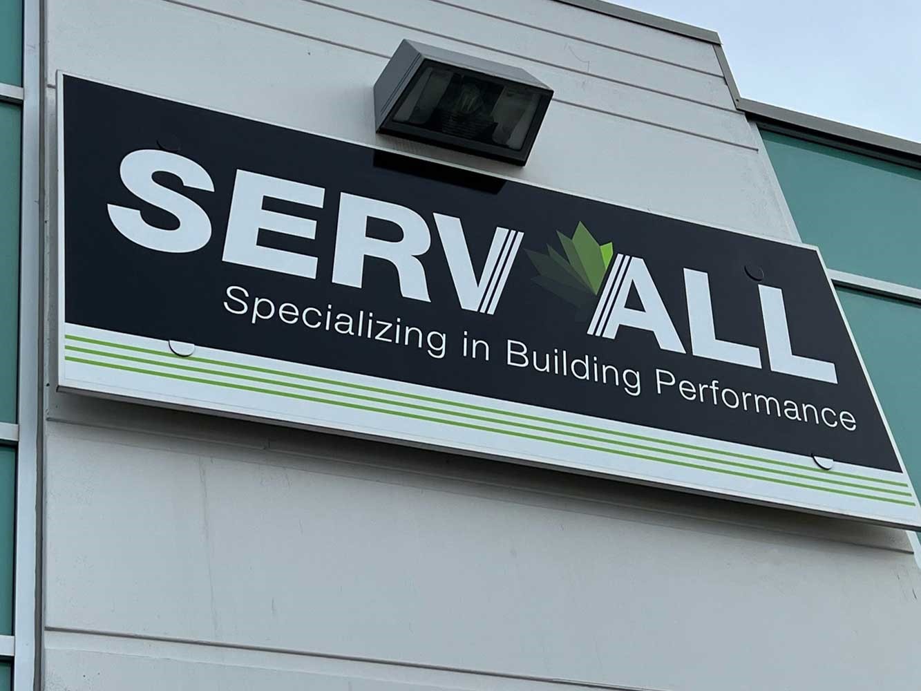
1. Use Your Brand Logo
It may seem obvious, but you should include your company logo on each and every marketing piece. This includes everything from brochures and business cards to signs and posters. You want your audience to easily recognize and remember your logo. The best way to do this is to have it everywhere. Plus, if it’s visible on your trade show banners, consumers can see the logo from across the room or find you easily in a crowd.
To get the most out of your logo, follow some simple guidelines. For example, make sure the image itself clear and crisp. A high-resolution vector image makes it easy for the logo to be placed on all types of marketing materials, which means you or your graphic design service can use the same format each time. Your logo is your brand and creating brand awareness is crucial to succeed at trade shows.
2. Script Clear Text
The language of the banner or sign is also important. This means that any text you use should be in a clear font of appropriate sizing, such as your company name in bold print so it can be read from across the room. The last thing you want is to use tiny text that can’t be read from a distance. Large text in a readable font is the best method to do this in regard to banner words.
Placement is also important when it comes to the text on your custom event signs. For example, you want the name of your company to be somewhere highly visible, like the top or middle of a banner. Keep in mind that you don’t need the text to be in all caps. Instead, use a mix of capitals and lowercase letters for ease of readability. You can, however, use all caps when you want to highlight a particular word or phrase to catch your audience’s attention.
It’s also best to avoid being too wordy. Remember, you have limited space on your sign and you want it to be clear and concise. If you have room for your USP, or unique selling proposition, include it. Otherwise, be careful to only use as many words as necessary. The key is to be seen and be understood.
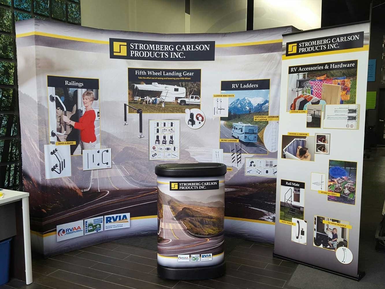
3. Include Visual Elements
Retractable banners don’t have to be all about text. You can add in photos for visual aspects that grab people’s attention. For example, you could display before and after photos if you are a company that remodels buildings. Or, you could have a photo of your product, such as a forklift if you manufacture large equipment.
Visual representations have the power to supplement interest and individuality to banners and signs at a trade show full of other companies. Photos also add an element of credibility by allowing the audience to see the products you offer. The idea is to make your materials stand out in the crowd and establish your company as one that others can trust.
4. Choose Colors Wisely
There are times when the visuals can be overwhelming, such as with colors or busy patterns. In general, you want to avoid colors that clash or background patterns that make it difficult to read your signage. One suggestion would be to use your brand colors. If your logo is blue and yellow, try to incorporate those into the design. Other options include the following:
The colors you choose can make or break your trade show banners, so choose wisely. You want to stand out in a good way, and colors play a large part of that.
5. Incorporate Contact Information
The last thing you want is to have a perfect display with all the right materials and be left with interested customers that have no way to contact you. That’s why having all the pertinent contact information readily available on posters and signs is incredibly helpful. This includes having the following on your materials:
This information is often left out and ignored, despite the importance of it. However, having this on your signs and banners can be a major benefit. That way, if people have any questions or if they wish to place an order, the contact information is right in front of them and you’ve made it easy for potential customers to reach you.
6. Utilize White Space
It sounds like you need to put a lot of aspects on your trade show signs, but the truth is that you do not want too much. There should be a balance between the elements and the white space, or space without any graphics or text. The white space allows the elements to all work together without being overwhelming or overcrowded in the space. This way, the audience can clearly see your banner without getting distracted by an overflow of information.
The key takeaway is that you need important information to be highly visible, but not overwhelming. In many ways, less is more. You need the appropriate amount of information but not too much. Be sure to take white space into consideration when you design your marketing materials, including signs and banners for trade shows.
Ready to begin? Look to Image360® for any, several or all of your needs.
Image360 is your all-in-one source for graphics that enhance, signage that works and displays that inform — including effective and affordable trade show graphics and displays. We work with you closely from imagination through installation to attain the high quality you seek, while adhering to your timeframe and budget. Contact us or drop by today to discover the many ways we can help you.